Miami Esports Rebrand
Miami Esports Rebrand
Miami Esports Rebrand
Miami Esports Rebrand
Miami Esports Rebrand
Role: Lead Graphic Designer
I was brought onto the Miami Redhawks Esports team as the Lead Graphic Designer for their upcoming 2025 rebrand. This was a comprehensive rebrand of all Miami Esports-related assets, including social media accounts, live stream setups, apparel, and gameday/results posts.
INITIAL CONCEPT
The goal of this rebrand was to move Miami Esports' presence in Miami's Athletics away from its inconsistent branding that focused on dark assets and glitchy effects, and toward a direction more closely aligned with other Miami University athletics. Our new brand identity features thin red boxes set against plain white backgrounds, which brings it much closer to the core Miami brand.
GAME DAY/SOCIAL MEDIA
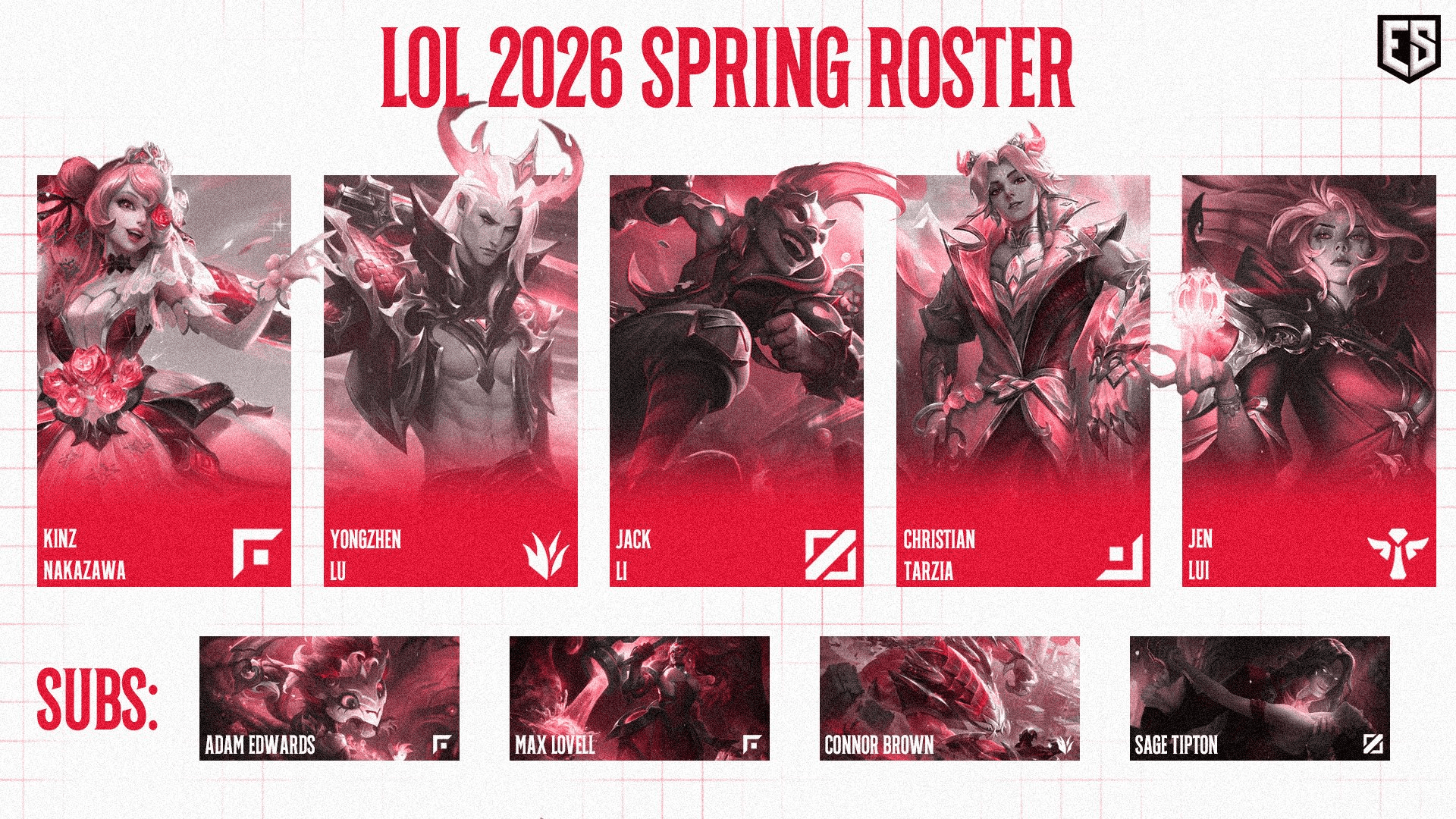
Game Day posts, alongside results posts, are the most common type of post you would find on our social media accounts. With our audience primarily being made up of parents and friends of our players, it was clear from the beginning that using our players characters, or photos of them were necessary in the rebrand, something that was not found in our previous style. Games featured on stream in the fall are shown with a thick red border around the entire flyer, while those featured in the spring are shown with a thin red border and thin lines intersecting around the outside of the flyer, to give each season a unique appearance.
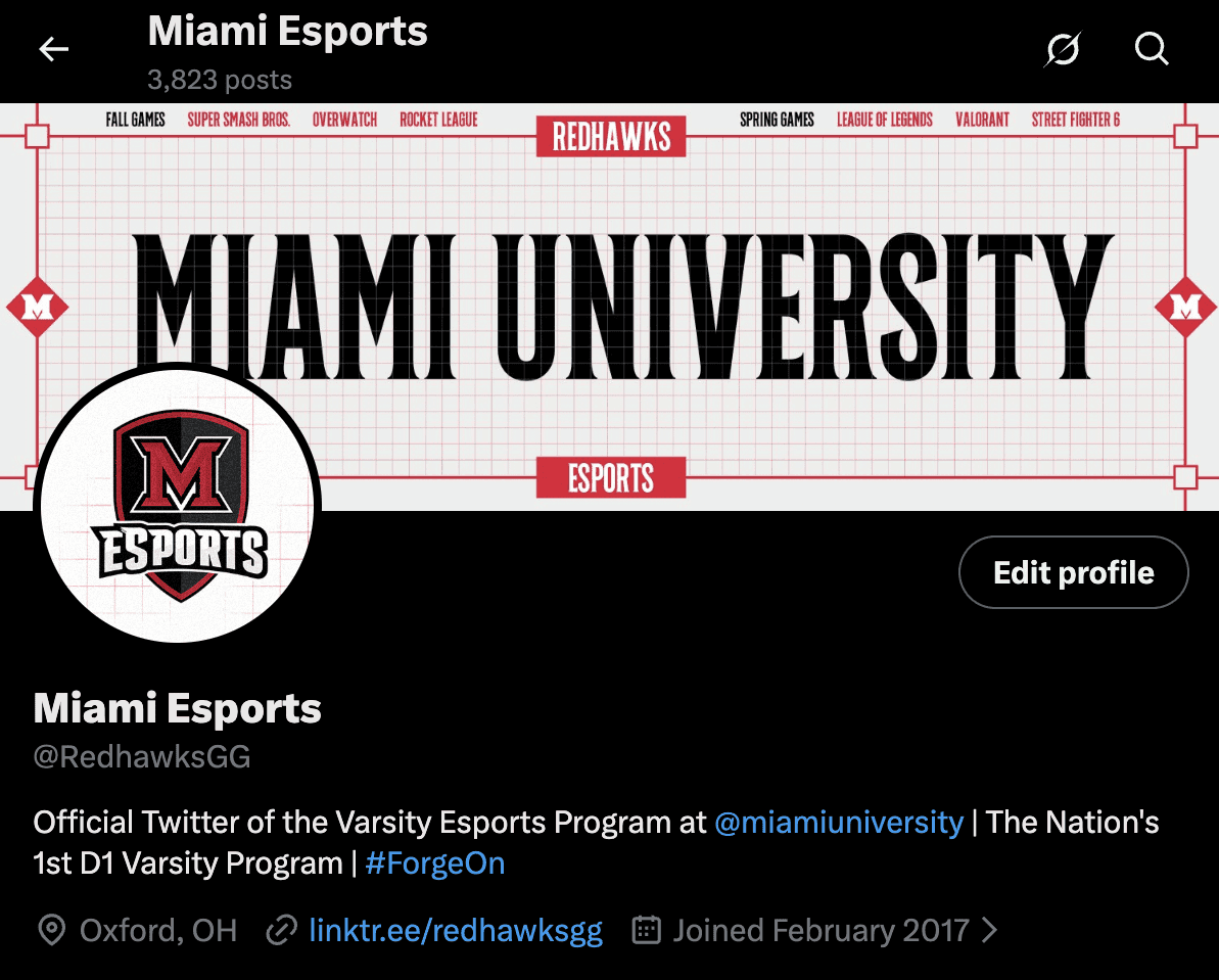
Our overall social media presence got a refresh as well. All of our platforms received new profile pictures, banners, and post formats to match the new identity we were building.
Role: Lead Graphic Designer
I was brought onto the Miami Redhawks Esports team as the Lead Graphic Designer for their upcoming 2025 rebrand. This was a comprehensive rebrand of all Miami Esports-related assets, including social media accounts, live stream setups, apparel, and gameday/results posts.
INITIAL CONCEPT
The goal of this rebrand was to move Miami Esports' presence in Miami's Athletics away from its inconsistent branding that focused on dark assets and glitchy effects, and toward a direction more closely aligned with other Miami University athletics. Our new brand identity features thin red boxes set against plain white backgrounds, which brings it much closer to the core Miami brand.
GAME DAY/SOCIAL MEDIA
Game Day posts, alongside results posts, are the most common type of post you would find on our social media accounts. With our audience primarily being made up of parents and friends of our players, it was clear from the beginning that using our players characters, or photos of them were necessary in the rebrand, something that was not found in our previous style. Games featured on stream in the fall are shown with a thick red border around the entire flyer, while those featured in the spring are shown with a thin red border and thin lines intersecting around the outside of the flyer, to give each season a unique appearance.
Our overall social media presence got a refresh as well. All of our platforms received new profile pictures, banners, and post formats to match the new identity we were building.
Role: Lead Graphic Designer
I was brought onto the Miami Redhawks Esports team as the Lead Graphic Designer for their upcoming 2025 rebrand. This was a comprehensive rebrand of all Miami Esports-related assets, including social media accounts, live stream setups, apparel, and gameday/results posts.
INITIAL CONCEPT
The goal of this rebrand was to move Miami Esports' presence in Miami's Athletics away from its inconsistent branding that focused on dark assets and glitchy effects, and toward a direction more closely aligned with other Miami University athletics. Our new brand identity features thin red boxes set against plain white backgrounds, which brings it much closer to the core Miami brand.
GAME DAY/SOCIAL MEDIA
Game Day posts, alongside results posts, are the most common type of post you would find on our social media accounts. With our audience primarily being made up of parents and friends of our players, it was clear from the beginning that using our players characters, or photos of them were necessary in the rebrand, something that was not found in our previous style. Games featured on stream in the fall are shown with a thick red border around the entire flyer, while those featured in the spring are shown with a thin red border and thin lines intersecting around the outside of the flyer, to give each season a unique appearance.
Our overall social media presence got a refresh as well. All of our platforms received new profile pictures, banners, and post formats to match the new identity we were building.



STREAM/MOTION
Motion was an area that we had not previously dipped our toes into, but were excited to utilize in the rebrand. We noticed motion amongst live stream and social media posts was an underused area for collegiate esports as a whole, and narrowed in precisely what would help our brand and team stand out amongst the rest. For social media, we decided to add victory/defeat and match MVPs for each of our games. This was another way to showcase our players, and their achievements towards our main audience.
Our stream also got a whole brand new coat of paint, which unique layouts for each game. The new layout sports all of our varsity titles along the top, while a countdown timer is shown alongside a message such as: Be right back, The stream is starting in, or thanks for watching. Alongside this timer, the main focus of thee screens lies with a rotating set of characters our players hand picked to be models for their respective titles. Lastly, a red sports ticker is added to the bottom of the layout, which can give added context to the title being played, game score, or how to support your favorite players.
STREAM/MOTION
Motion was an area that we had not previously dipped our toes into, but were excited to utilize in the rebrand. We noticed motion amongst live stream and social media posts was an underused area for collegiate esports as a whole, and narrowed in precisely what would help our brand and team stand out amongst the rest. For social media, we decided to add victory/defeat and match MVPs for each of our games. This was another way to showcase our players, and their achievements towards our main audience.
Our stream also got a whole brand new coat of paint, which unique layouts for each game. The new layout sports all of our varsity titles along the top, while a countdown timer is shown alongside a message such as: Be right back, The stream is starting in, or thanks for watching. Alongside this timer, the main focus of thee screens lies with a rotating set of characters our players hand picked to be models for their respective titles. Lastly, a red sports ticker is added to the bottom of the layout, which can give added context to the title being played, game score, or how to support your favorite players.
STREAM/MOTION
Motion was an area that we had not previously dipped our toes into, but were excited to utilize in the rebrand. We noticed motion amongst live stream and social media posts was an underused area for collegiate esports as a whole, and narrowed in precisely what would help our brand and team stand out amongst the rest. For social media, we decided to add victory/defeat and match MVPs for each of our games. This was another way to showcase our players, and their achievements towards our main audience.
Our stream also got a whole brand new coat of paint, which unique layouts for each game. The new layout sports all of our varsity titles along the top, while a countdown timer is shown alongside a message such as: Be right back, The stream is starting in, or thanks for watching. Alongside this timer, the main focus of thee screens lies with a rotating set of characters our players hand picked to be models for their respective titles. Lastly, a red sports ticker is added to the bottom of the layout, which can give added context to the title being played, game score, or how to support your favorite players.
APPAREL
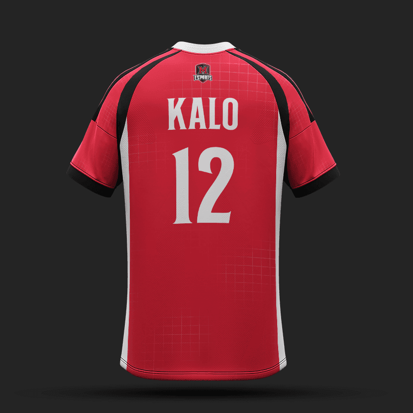
With the new rebranded graphics, it was only natural that our jerseys also got a new look. Our new jerseys feature our 3 main colors, red, black and white, each with a variant sporting one of the three as the primary jersey color. Additionally, the faded box pattern is seen throughout all jersey variants, alongside accent stripes on the sides, and on the sleeves of each jersey.
Our main inspiration for these jerseys comes from Football Kits in Europe. Every club team has 3 main kits with home, away, and alternate colorways. Because our teams don't travel for matches, what would be home, away, and alternate colorways were distributed to different section of the team as a whole. Varsity competitors received the white jerseys, while the creative team received the black version. All members of Miami esports received the alternate red color, which would be worn exclusively at events.
APPAREL
With the new rebranded graphics, it was only natural that our jerseys also got a new look. Our new jerseys feature our 3 main colors, red, black and white, each with a variant sporting one of the three as the primary jersey color. Additionally, the faded box pattern is seen throughout all jersey variants, alongside accent stripes on the sides, and on the sleeves of each jersey.
Our main inspiration for these jerseys comes from Football Kits in Europe. Every club team has 3 main kits with home, away, and alternate colorways. Because our teams don't travel for matches, what would be home, away, and alternate colorways were distributed to different section of the team as a whole. Varsity competitors received the white jerseys, while the creative team received the black version. All members of Miami esports received the alternate red color, which would be worn exclusively at events.


MISCELLANEOUS GRAPHICS
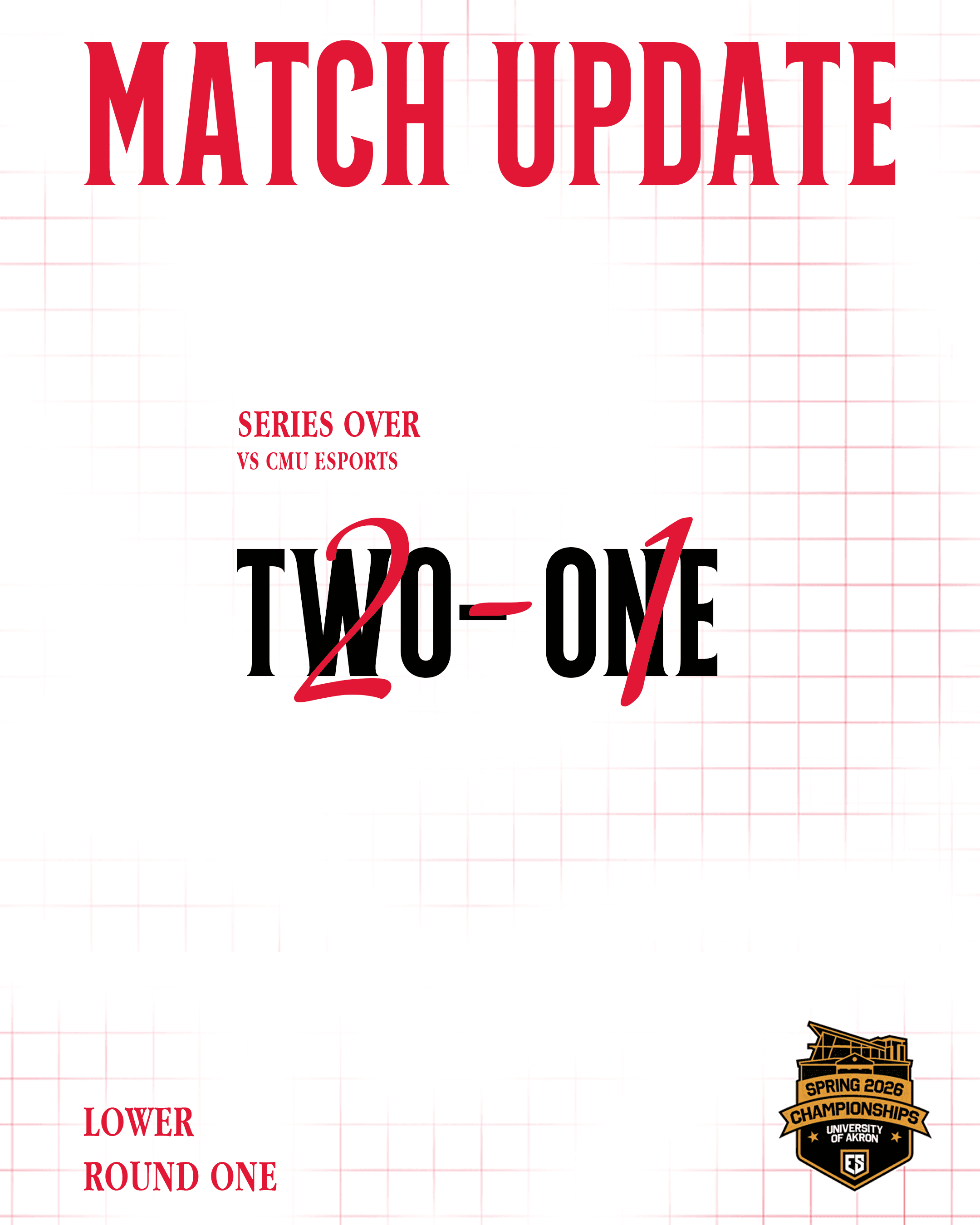
These graphics don't exactly fall into a category such as game day or motion, but were important to our overall rebranded presence. This year, we decided to create unique graphics for our respective titles that showcased the players and their characters on each varsity roster. Another example of these are the ones used during ESC Championships. Because of the fast paced hectic environment of an in person tournament, we felt it necessary to consistently update scores between each games for our fans that might not be able to watch every minute of the event. A clean simple graphic felt best to illustrate the game score, especially since it would be posted at least 5-10 times a day
MISCELLANEOUS GRAPHICS
These graphics don't exactly fall into a category such as game day or motion, but were important to our overall rebranded presence. This year, we decided to create unique graphics for our respective titles that showcased the players and their characters on each varsity roster. Another example of these are the ones used during ESC Championships. Because of the fast paced hectic environment of an in person tournament, we felt it necessary to consistently update scores between each games for our fans that might not be able to watch every minute of the event. A clean simple graphic felt best to illustrate the game score, especially since it would be posted at least 5-10 times a day